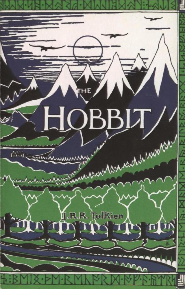
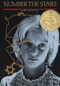
Journal Assignment #13: Book Cover Redesign Roundup

“Evil is a point of view.”

“Children can be nasty, don’t you think? ”

“Can I ask you something? Yes of course.  Are we going to die? Sometime. Not Now”

“I’ve been drunk for about a week now, and I thought it might sober me up to sit in a library.”

“There is nothing like looking, if you want to find something.”

“The sun did not shine. It was too wet to play. So we sat in the house. All that cold, cold, wet day.”

“You never really understand a person until you consider things from his point of view… until you climb into his skin and walk around in it.”

“I’d noticed that his eyes were black – coal black.”

“It was only in the fairy tales that people were called upon to be so brave, to die for one another. Not in real-life Denmark.”

“Men to the left! Women to the right!”

Posted in Uncategorized | Leave a comment

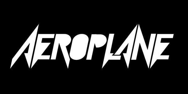
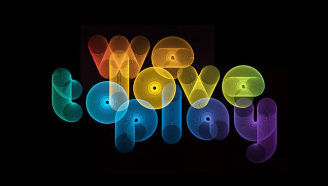
Journal Assignment #11: alphabet display inspiration

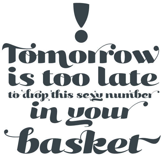
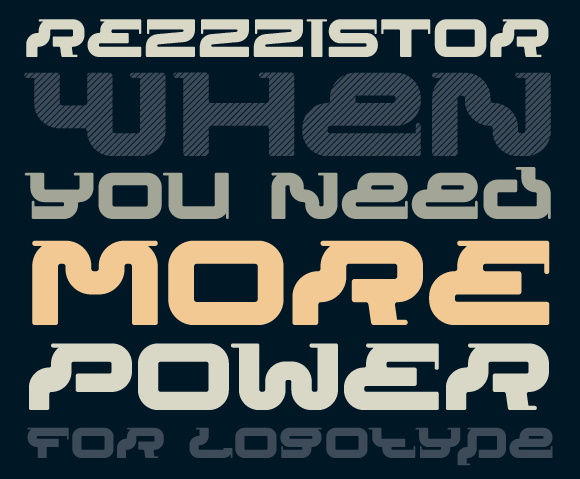
Found on typographyserved.com

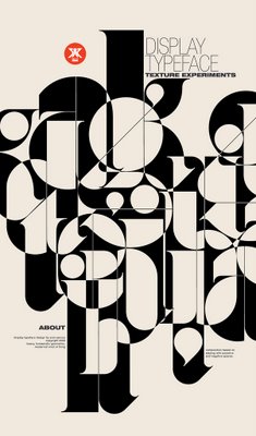
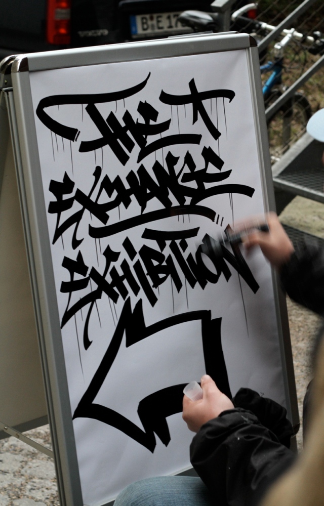
Found on flickr.com
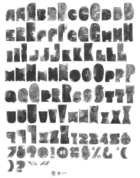
Found on myfonts.com
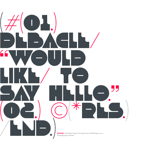
Found on blogspot.com
Found on pichaus.com
Found on ednacional.com
Posted in Uncategorized | Leave a comment

Project 4: Digital Typeface Design | all lowercase letterforms

Posted in Uncategorized | Leave a comment

Week 10: Numbers and Punctuation sketches:

Posted in Uncategorized | Leave a comment

Week 6 Journal Assignment: The Name Game

DStroke

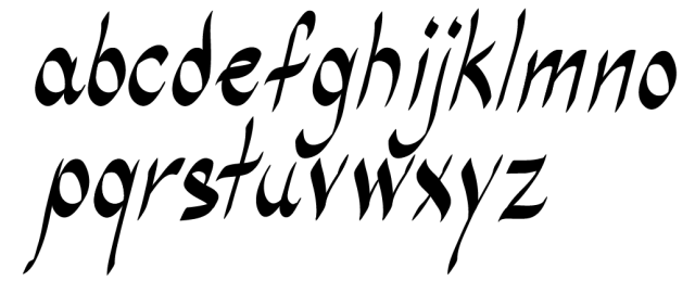
Basing letter forms off organic structures, this typeface is composed of elements meant to express free hand strokes.  These letters have the “thin & thick” calligraphic characteristic when dealing with line weight, which allows DStroke to be used as an elegant typeface if desired.  Having the letter forms slightly angled, DStroke shows movement from letter to letter.

Posted in Uncategorized | Leave a comment

Project 4: Digital Typeface Design | lowercase letterforms:

Posted in Uncategorized | Leave a comment

Project 4: Digital Type Face

Posted in Uncategorized | Leave a comment

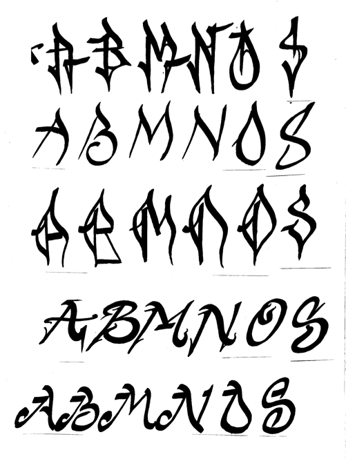
Journal Assignment 6: UPPERCASE sketches

I’m very interested in and inspired by hand drawn type. I feel Sketches 1, 3 and 4 express this most. I really enjoy the stroke-like lines that make up the letters. But, I also enjoy some of the aspects in sketch 4, such as the angled letters and the small detail. A collaboration is in the works!

Posted in Uncategorized | Leave a comment

Journal Assignment 5: Project 4 Research

Typography found on wall in L.A. Image found at http://www.robabeyta.com/index_a.htm

Typography on T-shirt. Image found at http://www.gcssantaana.com/

Handwritten Type. Image found at http://www.flickr.com

Killigraphy by Rob Dobi. Found on www.urbanfonts.com

Handwritten Type. Image found at http://jerseyjoeart.wordpress.com/page/10/

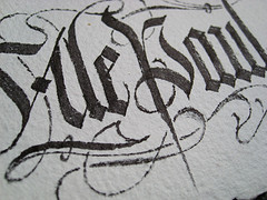
Typography by Gabriel Martinez Meave. Image found at http://flickrhivemind.net/User/Ale%20Paul

Arcana GMM Manuscript by Gabriel Martínez Meave. Found at http://www.linotype.com

Deutsch Gothic by James Fordyce. Found on www.fontsquirrel.com

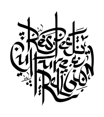
Arabic Writing Design by AJ Dimarucot. Image found at http://p-adamek0912-dc.blogspot.com/2009_11_01_archive.html

Handwritten Type. Image found at http://numbthumbs.wordpress.com/2010/08/27/calligraffiti/

Posted in Uncategorized | Leave a comment

Project 3: Modifying Type

Posted in Uncategorized | Leave a comment